Turning complex data into clear stories - designing the Deloitte Digital CX Drivers Report
The research behind the report is extensive - it’s packed with insights, metrics, and trends that shape how brands in Poland think about customer experience. My job was to make all of that accessible, engaging, and visually clear.
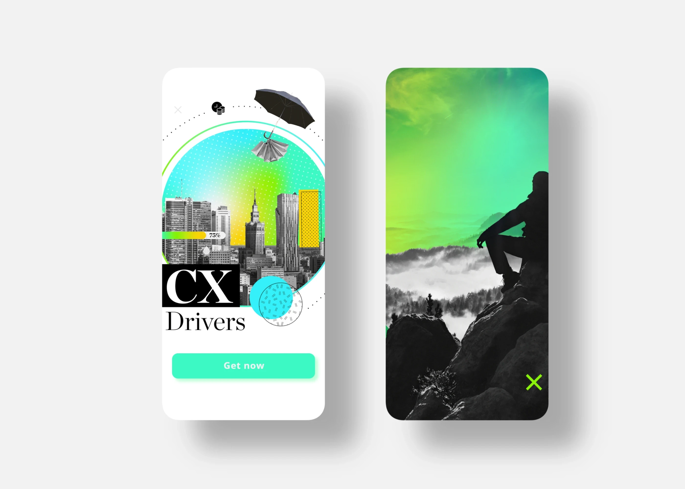
Aligning with Deloitte Digital’s visual DNA
Deloitte Digital has a strong, recognizable design language - clean layouts, structured grids, bold accents, and confident use of color. I wanted the report to feel unmistakably like Deloitte, but also give it enough character to stand on its own.
The visual system is built around geometric shapes, strong cityscape photography, and a mix of vibrant gradients with black-and-white imagery. This combination gave the content a modern, dynamic look, while keeping the structure clean and easy to navigate.
Making data approachable
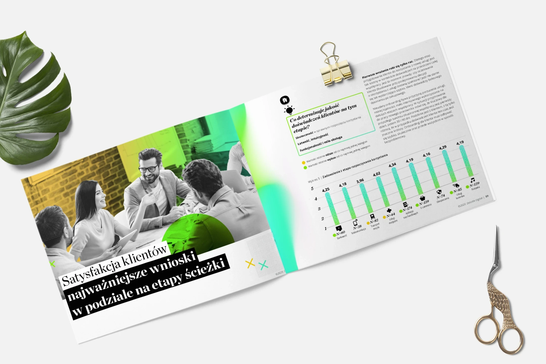
The real challenge here was the data. There was a lot of it - survey results, behavioural insights, percentages, rankings. Presenting it all in a way that doesn’t overwhelm the reader required careful planning.
I focused on:
Clear and consistent infographic styles, so readers could recognise patterns quickly
Compact layouts, so information stayed tight and easy to scan
Minimal colour coding, just enough to highlight key takeaways
Plenty of breathing space, letting the data lead the story rather than compete with it
The goal wasn’t to make the design flashy. It was to make it invisible in the right places — letting the numbers and insights speak clearly.
Simplicity isn’t boring. It’s powerful.
In projects like this, simplicity is everything. A good report doesn’t just look good; it reads well. When a reader can move smoothly from chart to chart without losing the thread, that’s a sign the design is doing its job.
I wanted each page to feel structured and intentional - no clutter, no visual noise. Just clean, smart design that builds trust in the data.
More than a report
In the end, the Polish CX Drivers wasn’t just a publication. It became a designed experience — one that aligns with Deloitte Digital’s brand, but also respects the reader’s attention. It’s a balance between storytelling, structure, and brand expression.