In 2024, I led a full rebrand of an IBM company and European leader in cloud services – working from the inside as a Senior Graphic Designer.
The goal was simple but ambitious: modernise the visual identity, make it more scalable, and give 2,000+ employees tools they’d actually love using.
Reimagining a cloud leader from the inside
The company’s branding had to do a lot of heavy lifting. As part of IBM, it needed to feel more mature and trustworthy, but still keep the energy and distinct personality of a fast-growing, cloud-native company.
I was responsible for the full journey:
Brand and visual strategy
System design (colours, gradients, icons, illustrations, templates)
Rollout planning, documentation and training across the organisation
Because I was embedded in the design and marketing teams, the work wasn’t just about how the brand looked – it was about how people could actually use it every day.
A brand that had outgrown itself
The starting point was a deep dive into the existing identity.
Over several weeks, I:
Mapped what worked well and what people felt emotionally attached to.
Collected pain points from different teams: “Where does the brand slow you down?” “Where does it break?”
Analysed how the brand appeared across markets, channels and formats.
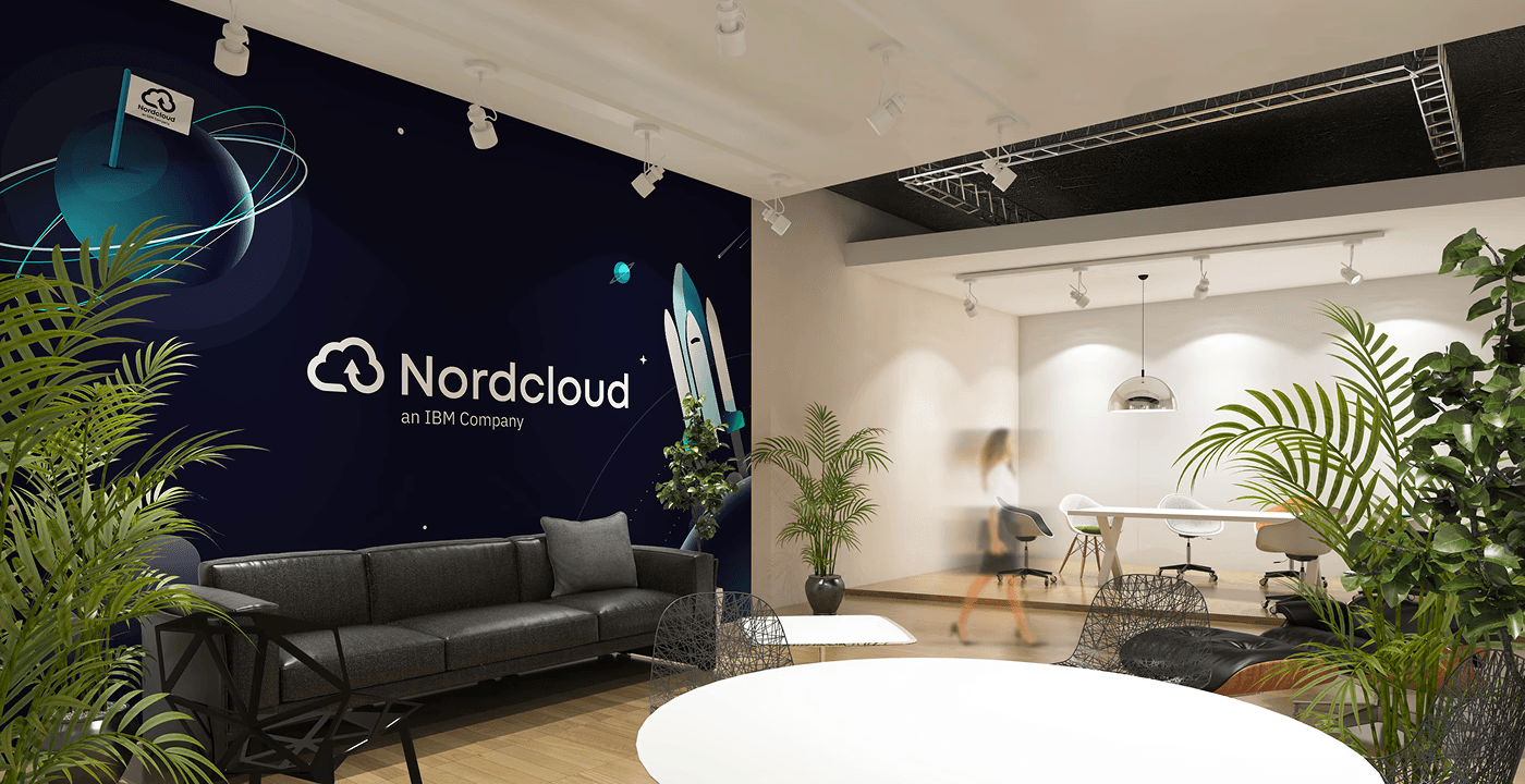
Nordcloud’s previous look leaned heavily on red as a primary colour. It was bold, but it didn’t fully reflect where the company was heading: a trusted, mature partner for cloud transformation at enterprise scale.
It was clear we needed to evolve from a strong but somewhat fragmented look into a cohesive, scalable system.
A new colour system for trust, depth and flexibility
The new palette starts with a deep navy as the core brand colour – grounding the identity and signalling stability, reliability and professionalism.
To keep the brand lively and recognisable, I introduced:
Turquoise – for a fresh, modern tech feel
Soft baby blue – to add lightness and flexibility in layouts
Carefully balanced supporting tones for backgrounds, data visualisation and UI states
Every colour decision was made with real-life constraints in mind:
Accessibility: combinations tested to meet contrast standards for web and digital products.
Print reliability: colours tuned to behave predictably in both office and professional printing.
Presentation reality: palettes that stay readable on projectors and varied screens, not just on a perfect retina display.
The result is a palette that feels more trusted and grown-up, without losing Nordcloud’s dynamic character.

Gradients and patterns - breathing new life into existing assets
Once the base palette was in place, I extended it into a flexible system of gradients and patterns.
The aim wasn’t to decorate for the sake of it, but to:
Refresh existing illustrations and visuals without restarting from zero.
Create a sense of motion and depth that reflects cloud transformation journeys.
Give designers and non-designers simple, reusable building blocks.
Gradients were crafted to work across:
Presentation backgrounds and section dividers
Social media graphics and campaign visuals
Website hero areas and illustration backdrops
This approach allowed us to modernise Nordcloud’s look while respecting existing brand equity.
A 500-icon system built for everyday work
Icons are one of the most used – and most abused – parts of any brand system. For Nordcloud, they’re crucial for explaining complex cloud concepts quickly and clearly.
I designed a minimalist yet expressive icon set of around 500 custom icons, covering:
Services, solutions and capabilities
Industries, use cases and tooling
UI and system icons for consistent digital experiences
Beyond drawing the icons, a big part of the work was making them truly usable:
Clear naming conventions so people can actually find what they need.
Logical grouping and folder structure across tools (from design software to PowerPoint).
Optimisation for different sizes and environments (presentations, web, documents).
The result is an icon system that doesn’t just look consistent – it reduces friction in daily work.
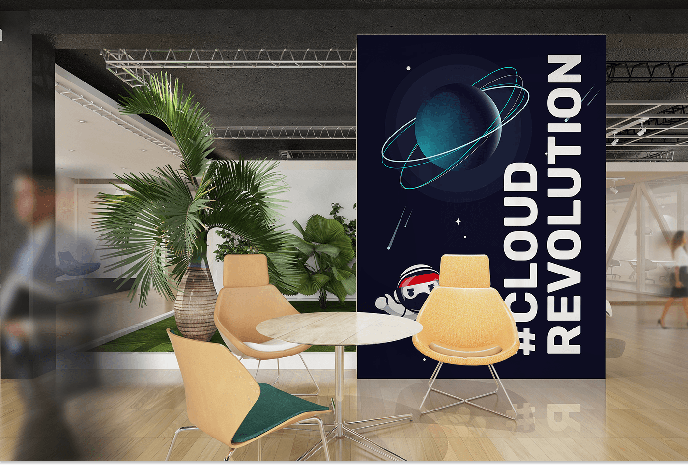
Ninjas in space - modernising a beloved mascot
Nordcloud has a long-standing internal mascot: the ninja. It’s part of the culture and story, and employees feel strongly attached to it. The rebrand wasn’t about replacing this character – it was about evolving it.
We introduced a new chapter: Ninjas in Space.
The updated illustration style:
Keeps the playful, skilful personality of the original ninja.
Places them in futuristic, space-inspired environments that reflect Nordcloud’s ambition and innovation.
Uses the new colour palette and gradients to tie everything into the refreshed identity.
These illustrations now support:
Internal communications
Employer branding and recruitment
Presentations and storytelling pieces
They preserve the emotional connection while aligning with the new visual direction.
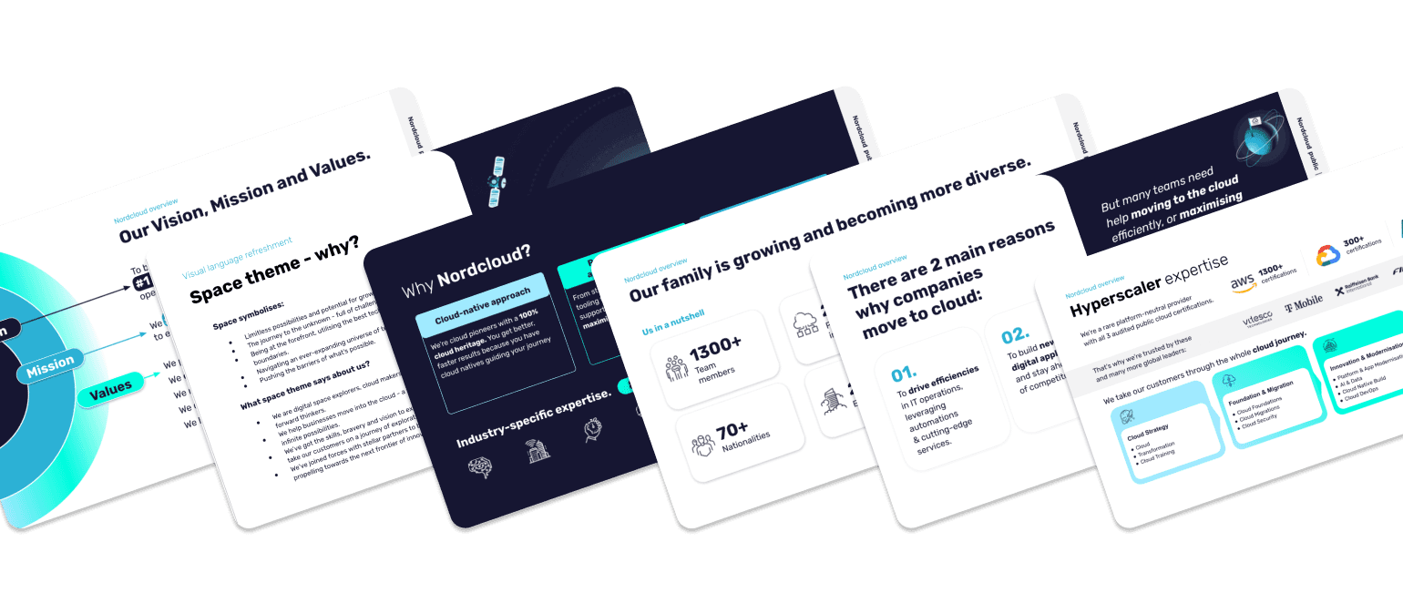
Templates that scale - from slides to social to documents
A rebrand only works if people can use it easily. That’s why a big part of the project was building template systems for different teams and channels.
I created a library of templates for:
Presentations
Google Slides and PowerPoint
Slide types for strategy decks, sales pitches, training, and reporting
Flexible layouts that encourage good content structure without feeling rigid
Social media
Post templates for thought leadership, event promotion and hiring
LinkedIn banners and post formats for a coherent, recognisable feed
Documents
Word and Excel templates for proposals, reports and internal docs
Simple, readable layouts that balance brand expression with clarity
These templates give everyone – from marketing to sales to HR – a strong baseline. People don’t have to reinvent layouts, and the brand looks consistent by default.
Standing out in the digital space
On channels like LinkedIn, dozens of cloud providers are competing for the same attention. The company’s refreshed identity needed to cut through while staying professional.
Using the new palette, gradients, icons and illustrations, I developed:
Profile and company banners that clearly position Nordcloud as a modern, premium cloud partner.
Post templates that make even text-heavy content feel structured and approachable.
Visual patterns that scale from small thumbnails to event campaigns.
The brand now has a recognisable voice in crowded digital environments – one that feels both distinct and credible.
Rolling out a rebrand to 2,000+ people
Implementing a rebrand in a company of over 2,000 employees isn’t just a design challenge – it’s a change management project.
To make the rollout smooth and successful, I focused on:
Training sessions
Live trainings for different teams
Walkthroughs of the new system: what changed, why, and how to use it
Practical demos of templates, icons and illustration libraries
Clear documentation
Brand guidelines focused on real use cases, not just theory
Step-by-step instructions for accessing and using assets
Feedback loops
Collecting input after the first waves of usage
Adjusting templates and assets where needed
Answering questions
The rebrand was warmly received across the organisation and adopted quickly, because people felt it was designed for them, not just for a portfolio piece.
More than a new look
This project was about much more than changing colours and visuals. It was about:
Giving Nordcloud a visual identity that matches its position as a leading European cloud provider and an IBM company.
Making everyday work easier for teams who create decks, documents and digital content.
Building a scalable system that can grow with the company.
The goal here wasn’t to chase trends. It was to create a brand that’s clear, consistent and genuinely useful – for the people who work at Nordcloud and the clients who trust them with their cloud journeys.