Turning a tech conference into a movement - branding The Cloud Revolution Summit
The Cloud Revolution Summit was never meant to be just another tech event. The organisers wanted a visual identity that would attract innovators, disruptors, and people who are tired of the usual “blue gradient + generic icons” tech branding.
My role was to build a bold, grunge-inspired identity that could carry that energy across every touchpoint: from the first social media teaser to the event stage.
Translating “Cloud Revolution” into a visual concept
The starting point was the name itself. “Cloud Revolution” suggests something bigger than infrastructure or software – it’s about changing how businesses think, build, and scale.
To express that, I leaned into a visual language that feels rebellious and unapologetic:
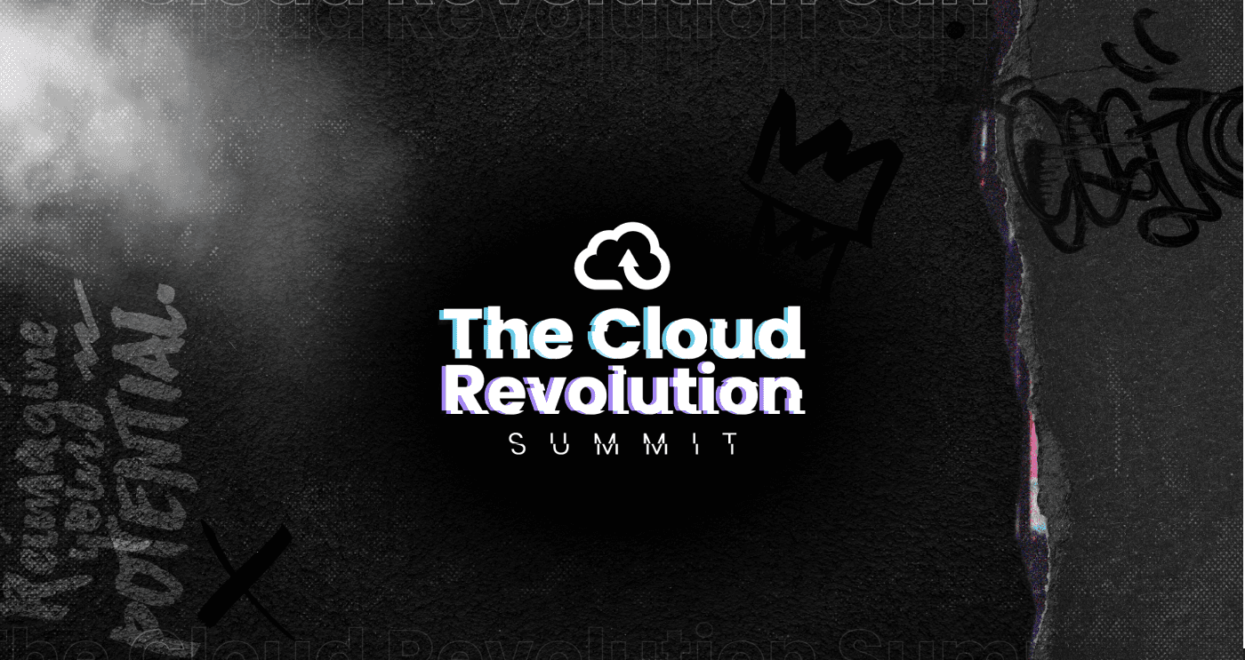
A moodboard inspired by rock posters, street visuals and underground culture.
Clouds reimagined as something electric and powerful, not soft and corporate.
A tone of voice that speaks about reshaping strategy and breaking what no longer works, rather than just “adopting new tools”.
The goal was to make the brand feel like an invitation to join a movement, not just attend a conference.

Building a grunge-inspired visual language
Grunge design was a natural fit for this project – it’s imperfect, textured, and always a little unpredictable. But it still had to be usable and consistent across dozens of assets.
I built the system around a few key ingredients:
Colour palette
A high-energy mix of electric blues, vibrant purples, and deep blacks. These colours helped create strong contrast on both digital screens and printed materials.Textures & composition
Torn-paper layers that feel handmade and raw.
Gritty backgrounds and noise overlays to break the “clean tech” look.
Compositions that feel slightly chaotic, but are still structured enough to guide the eye.
Typography
Bold, edgy display fonts for headlines that demand attention.
Supporting typefaces chosen for clarity across agendas, speaker lists and schedule grids.
Graphic elements
Cloud motifs fused with glitch and rock-inspired visuals.
Custom icons and small illustrations that connect tech themes with a more human, emotional aesthetic.
Together, these elements create a visual world that feels intense and alive, but still recognisably part of a single identity.
Designing the attendee journey
Like in any event branding project, the real test was not a single poster – it was the entire attendee journey.
I mapped the brand across:
Pre-event communication
Social media teasers that introduced the visual language in small, bold hits.
Digital banners and email headers that made the summit immediately recognisable in a crowded inbox.
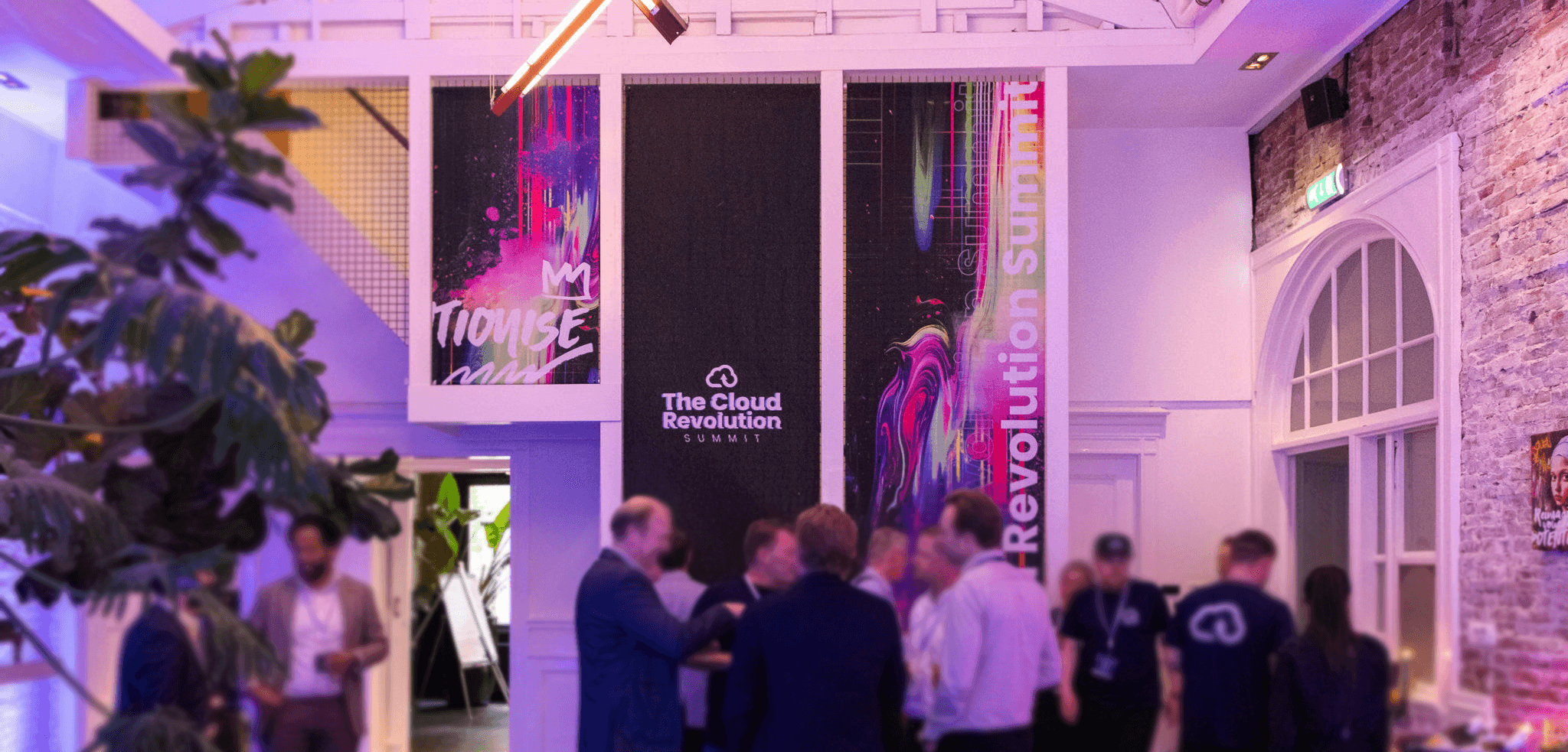
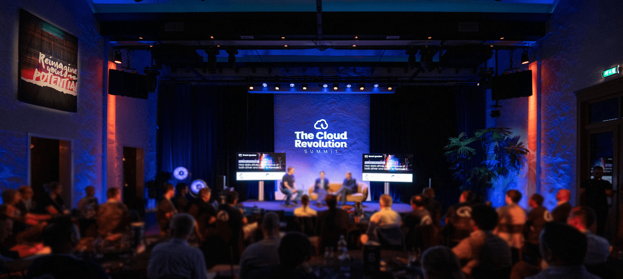
On-site experience
Stage visuals that amplified the grunge aesthetic without distracting from the speakers.
Wayfinding and signage that kept the rough, textured look but stayed legible at a distance.
Badges and lanyards that felt more like merch than standard conference accessories.
Post-event touchpoints
Recap visuals and highlight graphics that helped extend the life of the event online.
A flexible template system for sharing quotes, photos and key takeaways in the same visual style.
The outcome: an experience where attendees could immediately feel that this wasn’t a typical “one more tech event”. The visual identity supported that perception from first impression to last email.
Keeping the chaos intentional
Grunge can easily tip into “visual noise”. A big part of this project was making sure the chaos was intentional, not random.
To keep things under control, I focused on:
A consistent grid behind the mess – layouts start structured, then textures and torn elements are layered on top.
Strict type hierarchy – one hero type style for headlines, one for subheads, and one for functional content like times and locations.
Clear focal points – every asset has one main message (e.g. title, date, CTA), and everything else supports it.
That balance between raw energy and clear communication is what makes the branding feel strong rather than overwhelming.

More than a conference identity
In the end, The Cloud Revolution Summit brand became more than a logo and a couple of posters. It turned into a visual platform that:
Positions the summit as bold and forward-thinking.
Helps it stand out in a sea of look-alike tech events.
Creates an experience attendees can remember – and recognise next year.
The design isn’t there just to look good on - it’s there to make the content more engaging, the experience more memorable, and the brand harder to ignore.